
Ohio University
Website redesign
Duration | 3 years
Tools | Adobe XD, Illustrator, After Effects, Photoshop, Jira
Role | UX Design, UI Design, Interaction Design
Problem
Ohio University was primarily focused on a CMS migration, to move away from the existing Commonspot CMS into Drupal.
They needed a visual refresh, greater flexibility for their content, and a website they can invest more time in scaling rather than fixing.
To better reflect the Ohio University experience to our digital audience, University Communications and Marketing embarked on a redesign of ohio.edu and a comprehensive overhaul of how content is delivered online.
These initiatives were prompted to improve how we're marketing our university to prospective students and to meet the needs of OHIO’s growing mobile audience.
Goals
Every year, more than nine million individuals visit ohio.edu and view the University’s webpages more than 70 million times. The ohio.edu website consists of more than 100,000 webpages managed by decentralized web content editors working in departments across the institution.
The long-term goal of the project is a unified web presence offering an outstanding, best-in-class user experience for OHIO’s millions of digital constituents.
My Role
I led the UX/UI for this project. I also collaborated and received constructive feedback from two fellow designers in order to improve and get other perspectives about what I was designing.
Interviews
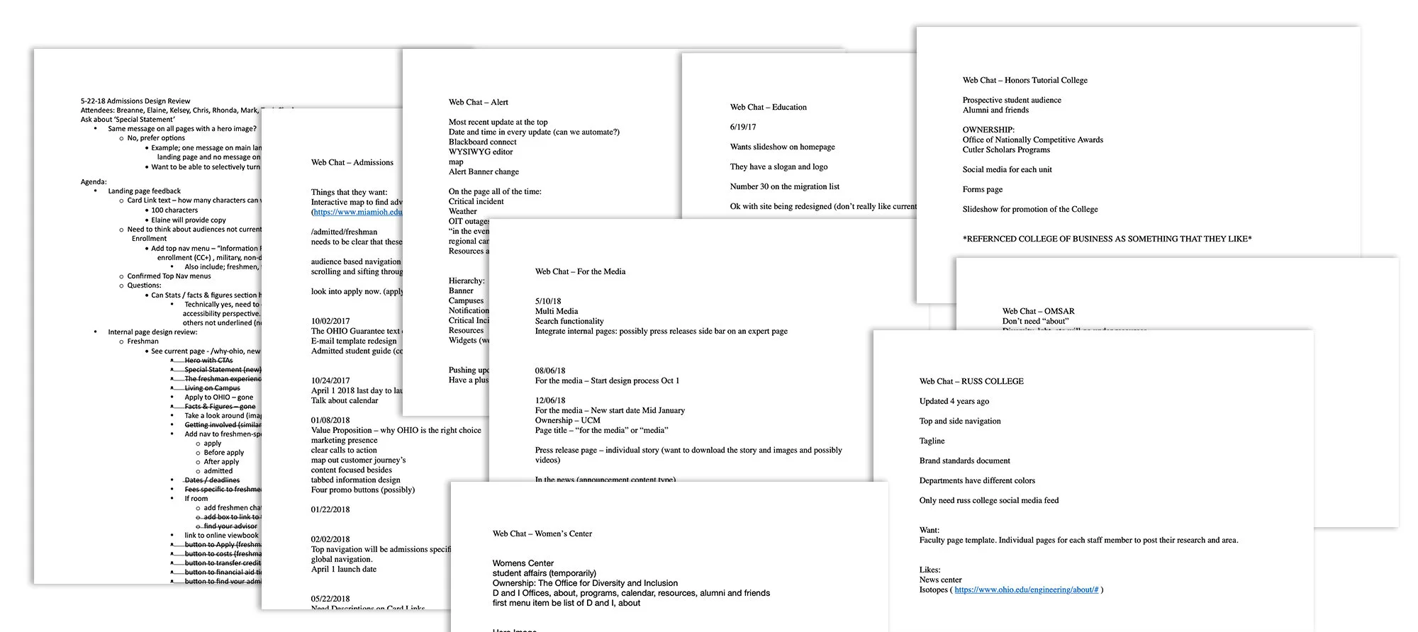
Before I got started on design my team and I interviewed current campus communicators, and students. Our goal was to understand our content editors' pain points and how we could solve them. We conducted dozens of interviews and discovered several issues that our customers experienced with the current CMS.
Competitive Analysis
Before starting design I researched a number of competitors in the higher education space. I looked at the full experience to get a better understanding of UX patterns, concepts, UI styling and interaction. I learned what works well and what missed the mark. Taking these new learnings, I applied it to the design and product to come up with the best possible experience for our users.

Design Iterations
Throughout the design process, we sent out surveys to gather feedback to develop the designs further. Elements and interactions were redesigned and iterated upon until the team felt like we landed in the right place.
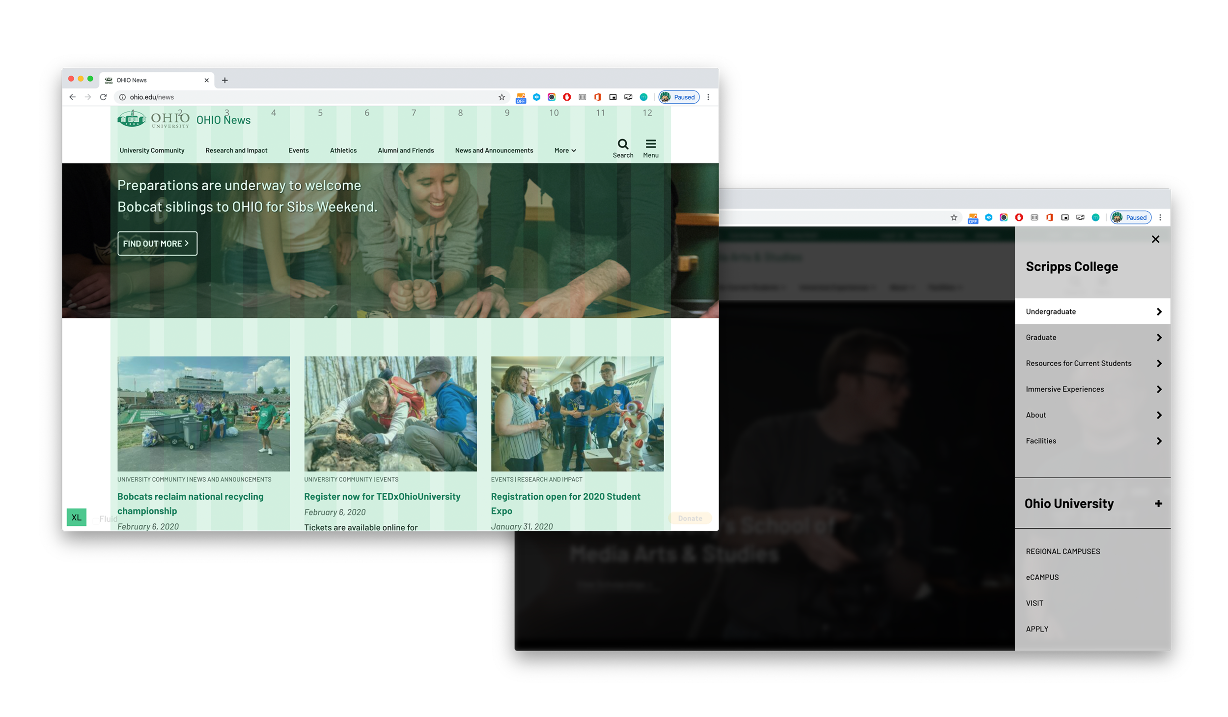
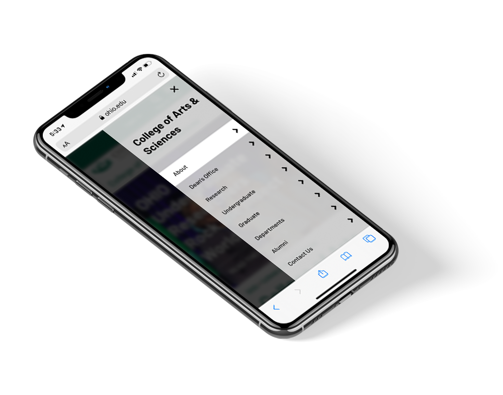
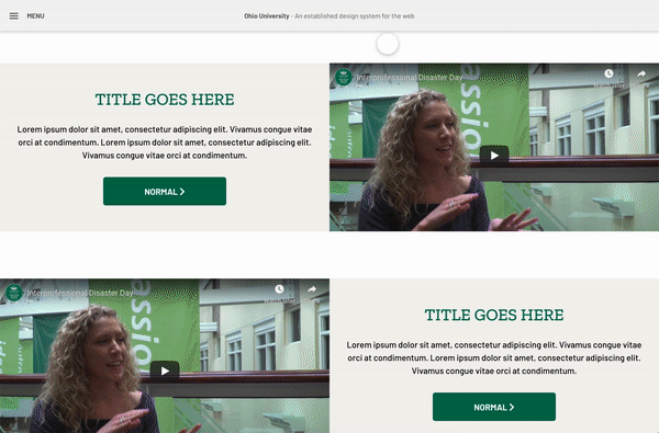
Design System
With the Ohio University website redesign well underway, we wanted to create a system to help with design and development. The goal was to create a single source of truth for all existing Ohio University elements. We also wanted to try and ensure quality and consistency across the entire web presence. Finally, we wanted to improve productivity for the designers and developers.
Why did we start a design system?
The designers (including me) highlighted the inefficiency of designing common patterns from scratch with limited visibility on existing reusable elements, and developers commented that it was time consuming to build and maintain different patterns for each site. Both found it difficult to know which of a project’s several files, inevitably all named ‘final’, they should be working from. Also, the lack of a shared language often led to confusion over guidelines and functionality expectations.
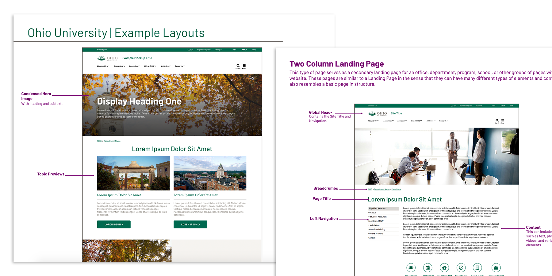
External style guide
Another important piece to the puzzle that we became aware of during the project was that, content editors who were going to be producing the pages didn’t know how the available elements were able to be used. We then decided to make a guide for people outside of the project to show them examples of how versatile the elements are. Having this one document helped make our meetings with all the departments more efficient. This style guide was added into the beginning of each new website meeting. The website owners were able to receive this document prior to the meeting to get an idea of how they want to lay out their new pages.
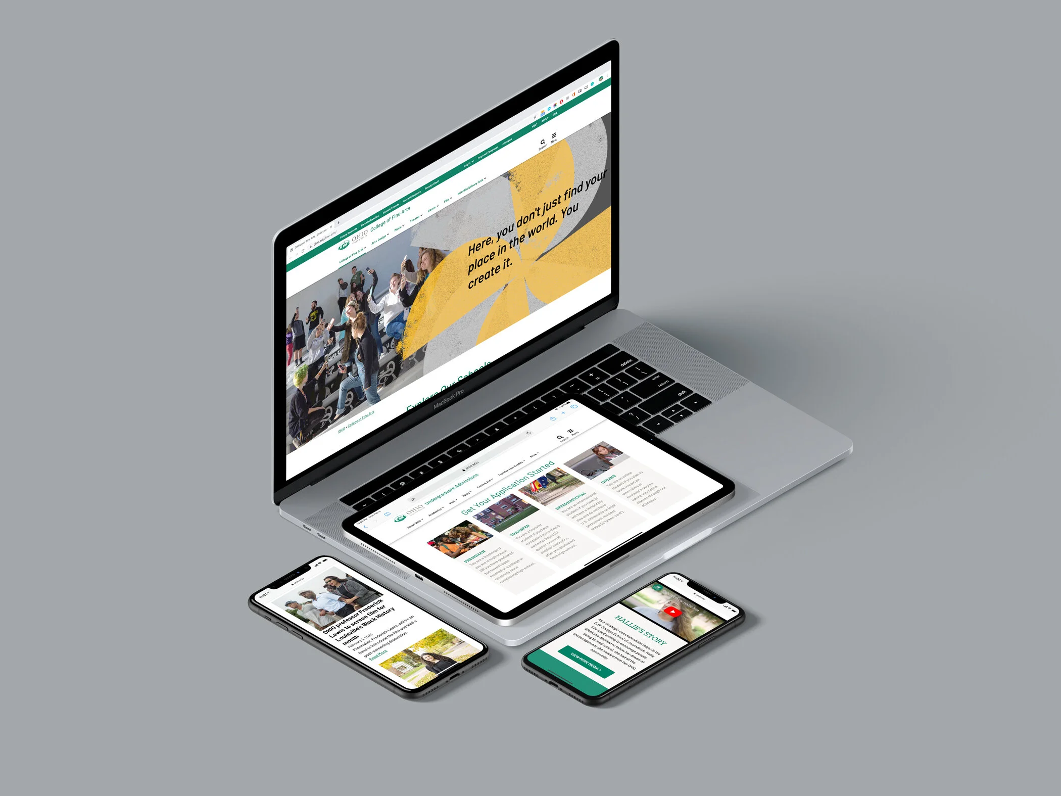
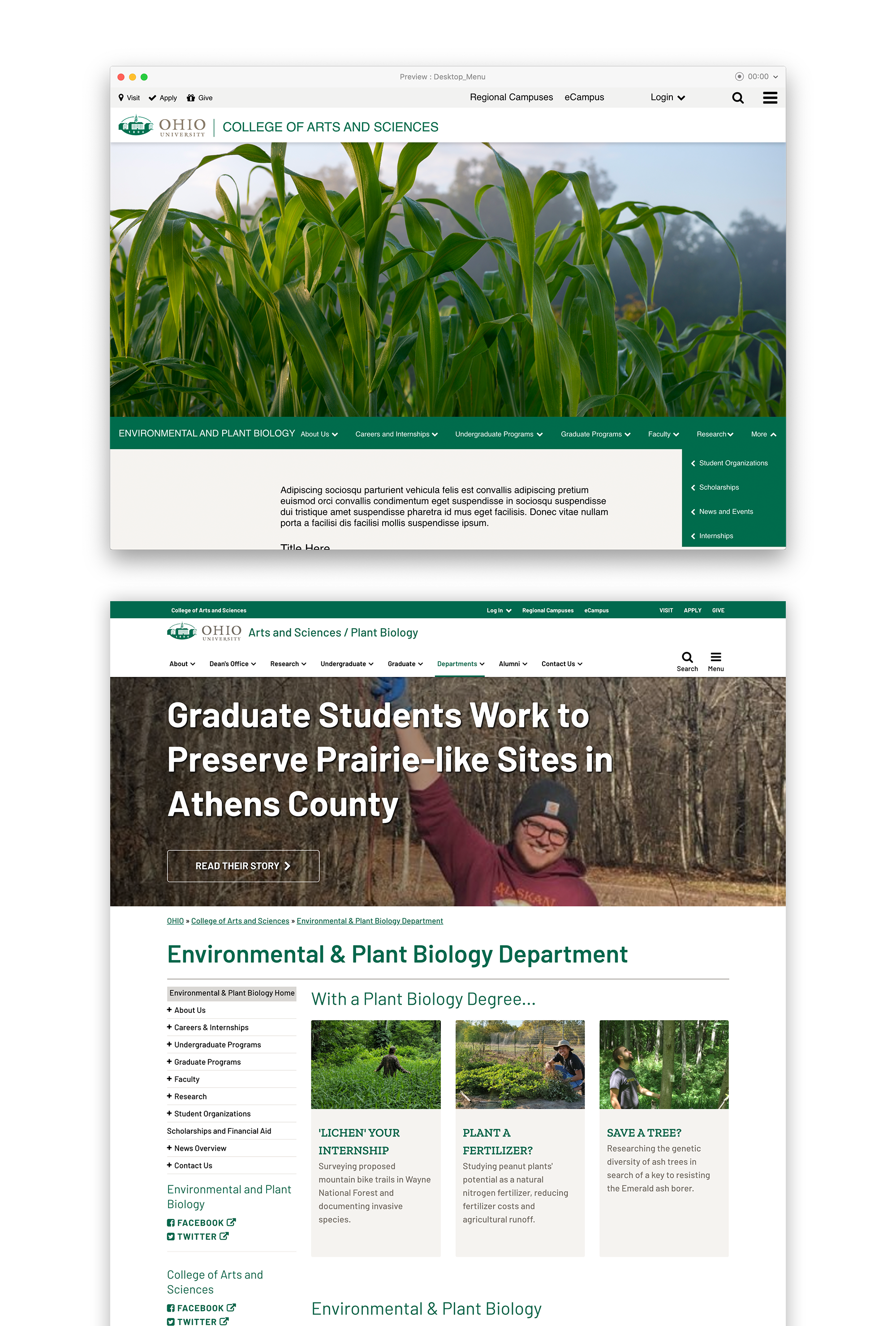
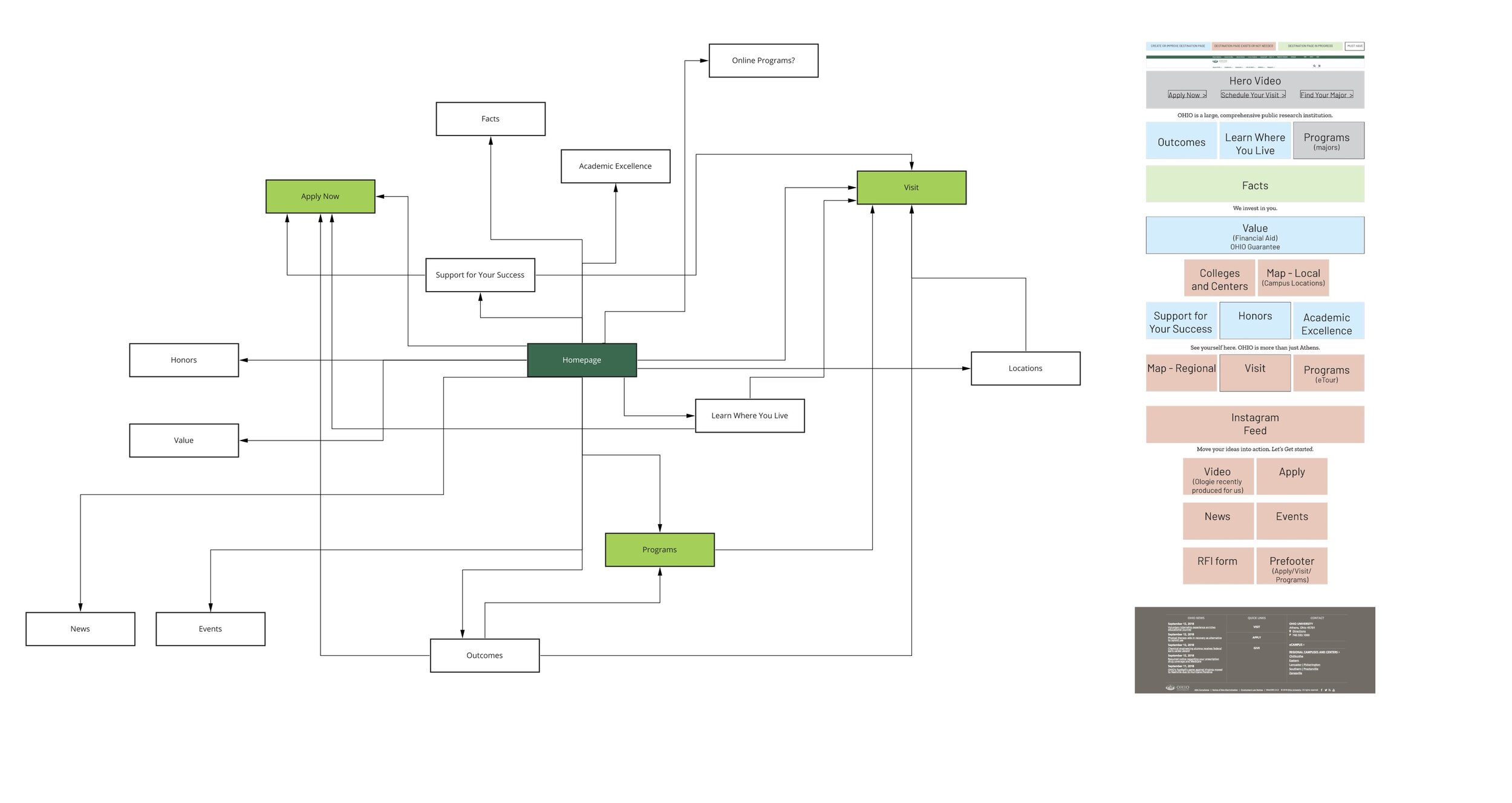
Homepage
The previous homepage didn’t really have a focused audience, and it ended up being more for current students/employees. The homepage also didn’t have clear calls to action and didn’t encourage exploration. We teamed up with undergraduate admissions to take on this task. The first phase of the project was spent gathering information.
Student focus groups
We gathered a mix of prospective and undergraduate students, ages ranging from 16 to 21, to get their thoughts on the current homepage. We also had them take a look at some of our competitors, and also other higher sites that we thought were doing a good job. They were given a list of topics that were potentially going to be on the homepage to put in order of importance. After listening to their thoughts and feedback, I was able to pick out the strong similarities.
Stakeholder Interviews
Since this project would literally change the digital face of Ohio University, we interviewed executive leadership and other units around the university that were needed to sign off on content approval for the supporting pages to ensure the information was up to date.
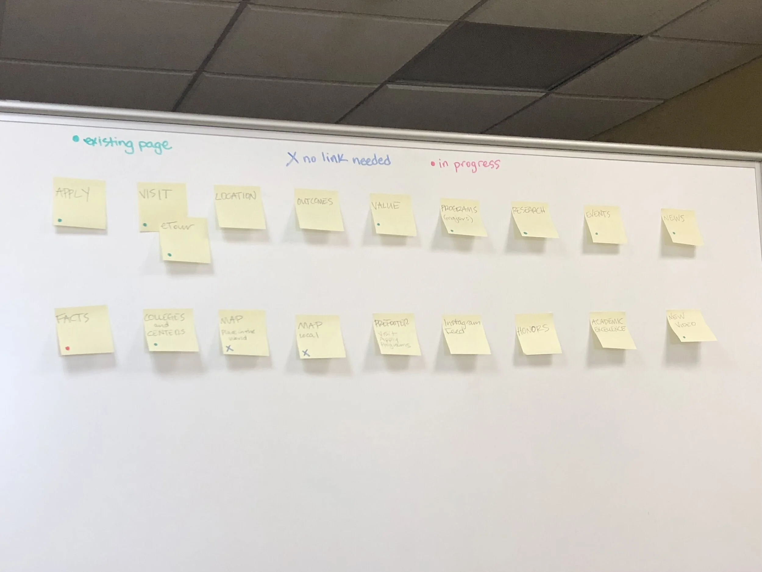
Content Audit
We hired a third-party vendor to help us identify where our content holes were for the focus that we wanted on the homepage. A content audit gave us a clearer picture of the “what” we needed to create and design. We identified 10 supporting pages that needed to either be created from scratch, or the content needed to be modified.
Test & Iterate
Web optimization tools validated design decisions around navigation paths and also uncovered areas of friction that hindered the user's ability to complete a task. These learnings were used to derive priority revisions for the next iteration of the UI and prototype. Before leaving the university we were planning the content restructuring of the homepage and identified pieces that would be cut out and replaced with more relevant content.
Takeaways
Collaborating with a cross-functional team
The ability to collaborate across cross-functional teams is an essential quality of a product designer. I got to collaborate with managers, developers working on multiple platforms, quality assurance team, marketing team to bring out the product to the customers. This helped me in accomplishing the goals as a team.
Learn about the user
I was able to narrow down the features for the first version of the product by learning about the users and their goals they want to achieve.
Design system
The design system brings together the design and development values, and usage guidelines, to ensure all new products follow the same experience, accessibility and performance standards. This helped everyone make decisions more efficiently across the board.
It’s not every day that a designer gets an opportunity to design an end to end product with a large consumer base. I’m glad that I got this opportunity which helped me in improving myself as a product designer impacting hundreds of thousands of people and the business.