GoFundMe Pro (Formerly Classy)
Design System
Duration | 2 years
Tools | Figma, Jira, Storybook
Role | Lead Product Designer
Problem
With the company continuously growing, and each team creating their own components, more inconsistencies in the look and feel within the product were starting to pop up. The challenge to create coherent experiences multiplies exponentially as more people are added to the mix. Also over time, no matter how consistent or small a team is, different people will contribute new solutions and styles, causing experiences to diverge.
What we found
Conflicting guidelines and direction
Duplication of common components
Inconsistencies across flows throughout the product
Pressure for agile solutions without discovery and research
Siloed teams working with disjointed communication
Goals
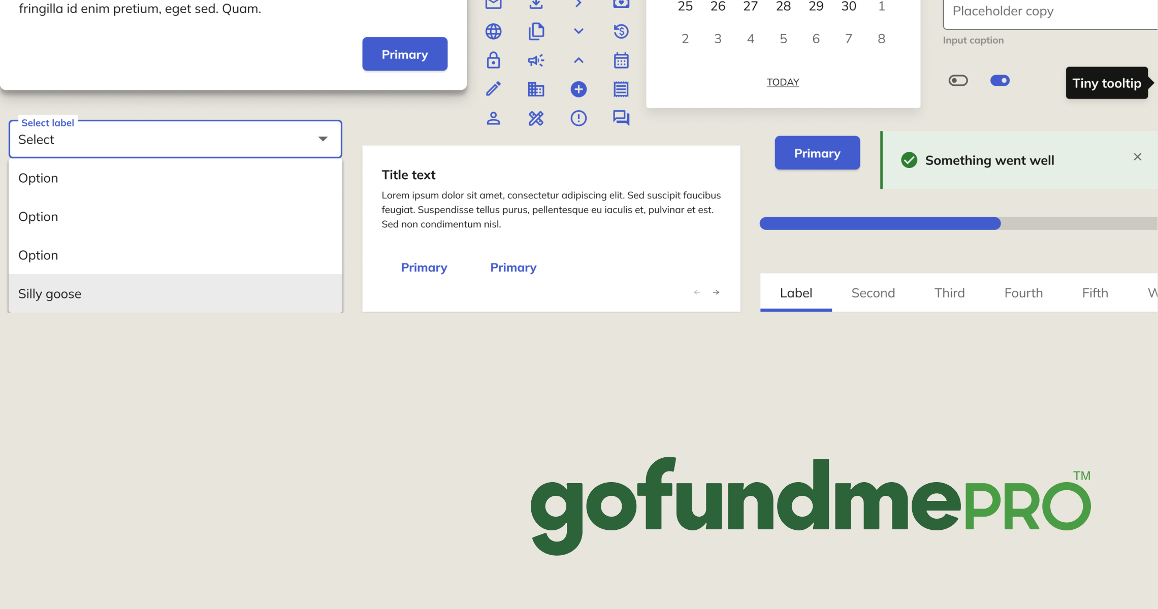
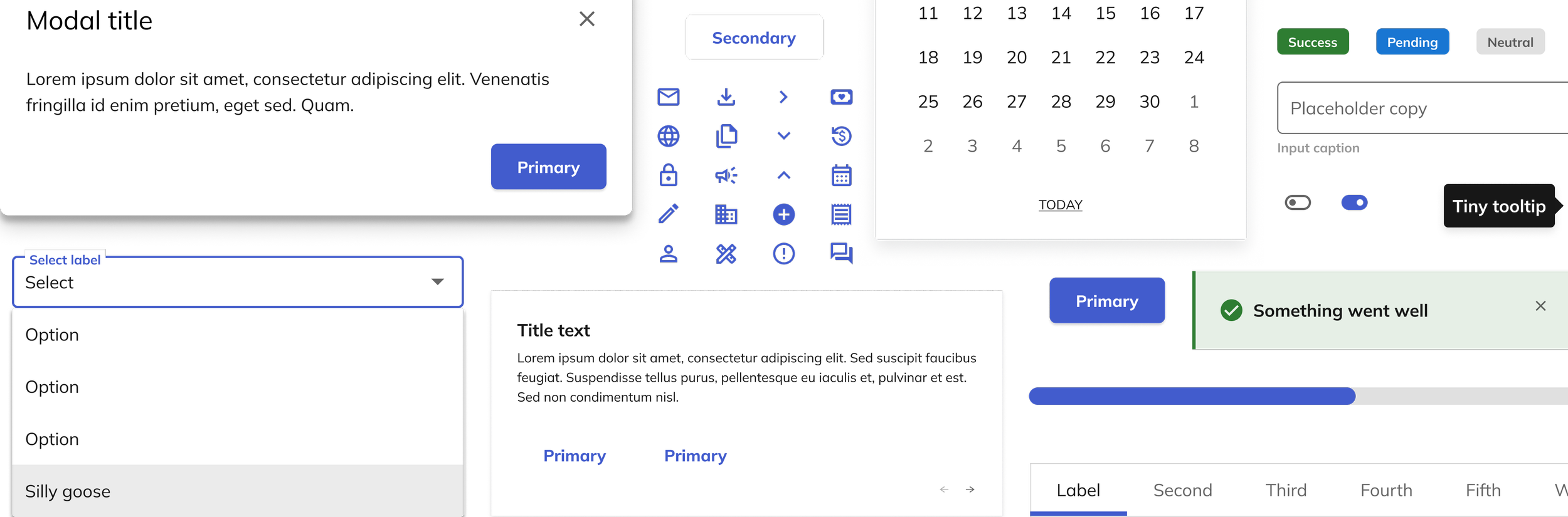
The goal was to create a composition of elements, components and patterns that underpin the appearance of Classy. It's meant to improve the UI consistency and quality and make the design and development process more efficient. Combining modern design with technology, the Classy Design System (a.k.a. Trove) is a unified language and the sole guide for designing and developing within the Classy ecosystem.
We wanted to take the burden off individual designers to think through commonly recurring design problems. With a full library of pre-approved components, designers can focus on bigger problems like creating seamless, intuitive flows that delight users.
My Role
I was hired as the lead product designer working on the brand new design system team. My work consists of research, designing and prototyping components and patterns for the main product, as well as working on documentation for other designers and developers at the company to know how designs should be used.
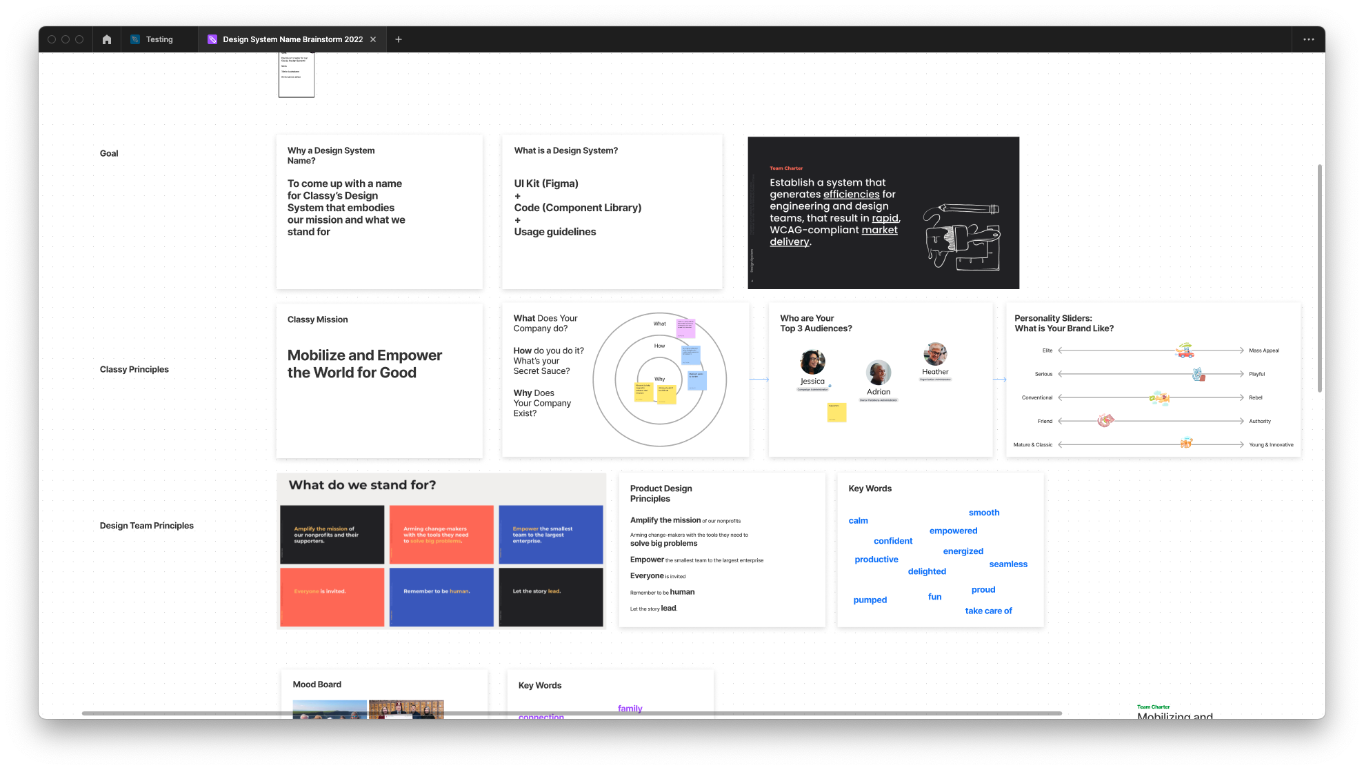
Getting started
When I joined Classy it was already an established product, which meant that I didn’t have the privilege of starting from scratch. Instead, we had to audit and turn our existing visual language into an organized system. I called on my fellow designers from other areas of the product for help with translating all of our existing designs into components in Figma. We got permission from the Chief Product & Technology Officer to give the designers a full month of pausing on their regular work to contribute to the kick off of the design system.
This part of the project was extremely time consuming, but also very beneficial. We were able to see for ourselves where most of the inconsistencies were, and also what components were important and already being used consistently.
As a new designer to the team, this was a great way to see the entire product screen by screen, and pixel by pixel. After my process here I had a better understanding of the product, where we needed to focus, and where we needed to make trade-offs.
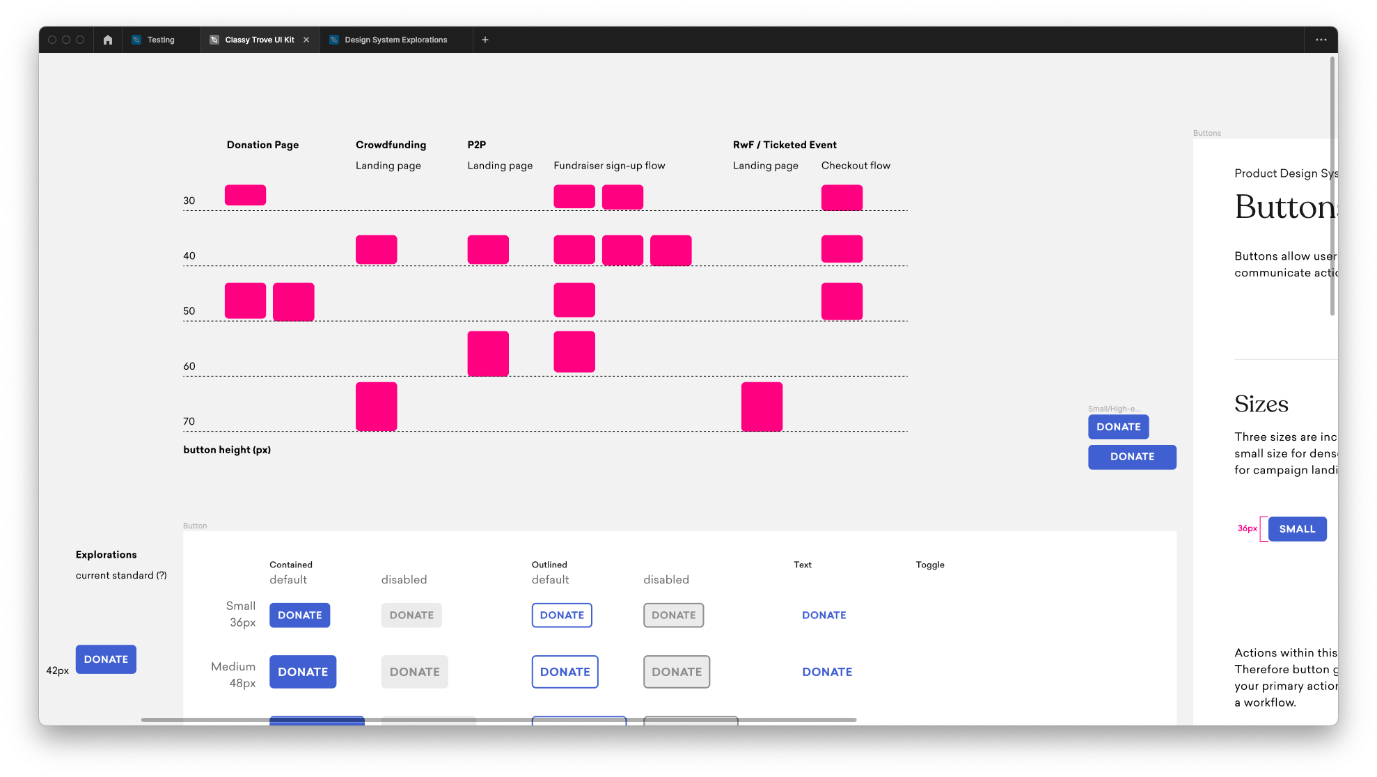
Impactful early wins
The next step was to prioritize, based on the UI audit, what elements were most commonly used across the product. These would be the areas that we tackled first.
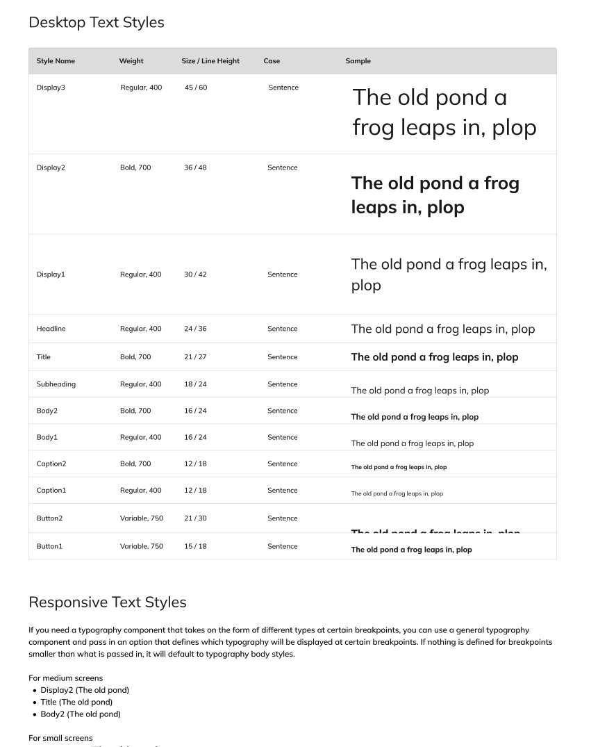
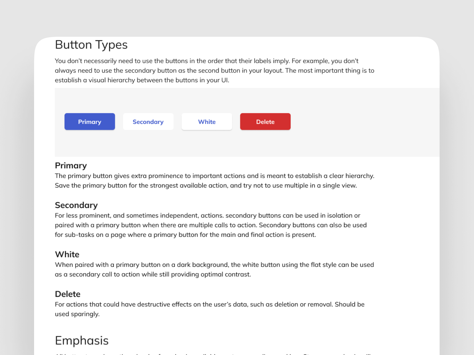
Once we identified the foundation elements for the system, it was time to start rethinking the style and rules around each area. We tackled typography, and general iconography first before moving onto the more formed elements such as buttons, alerts, etc. Revamping these pieces were quick wins that made a big impact on the look of the product.
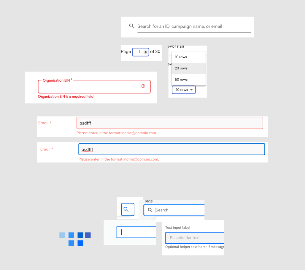
Accessibility
Any design system is only useful if it's accessible. While that perspective is typically user-focused, we felt it was two-fold. We wanted to make sure that we brought all of the internal teams along the journey through providing clear rationale, documentation, and education on the design system team's efforts in creating an accessible system.
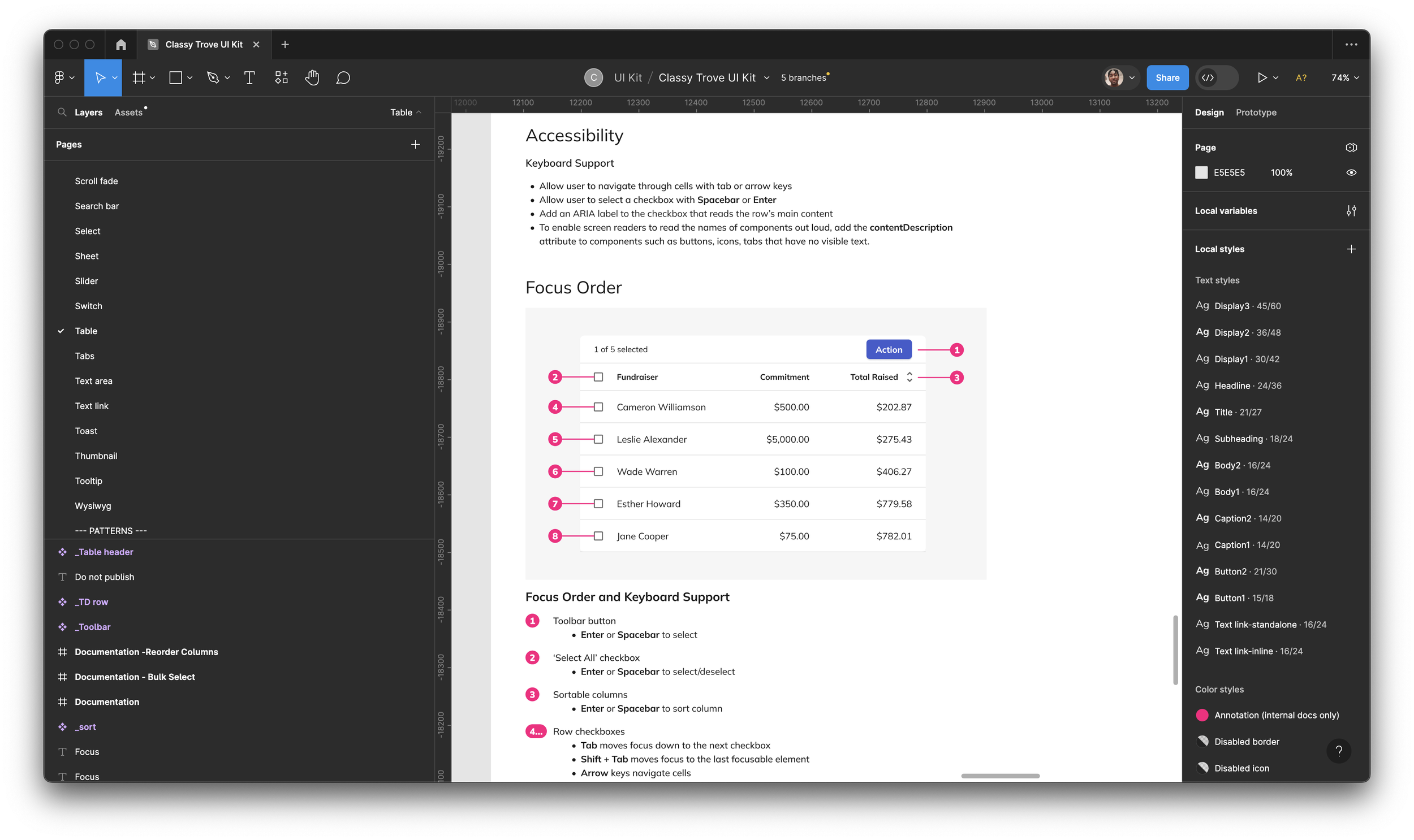
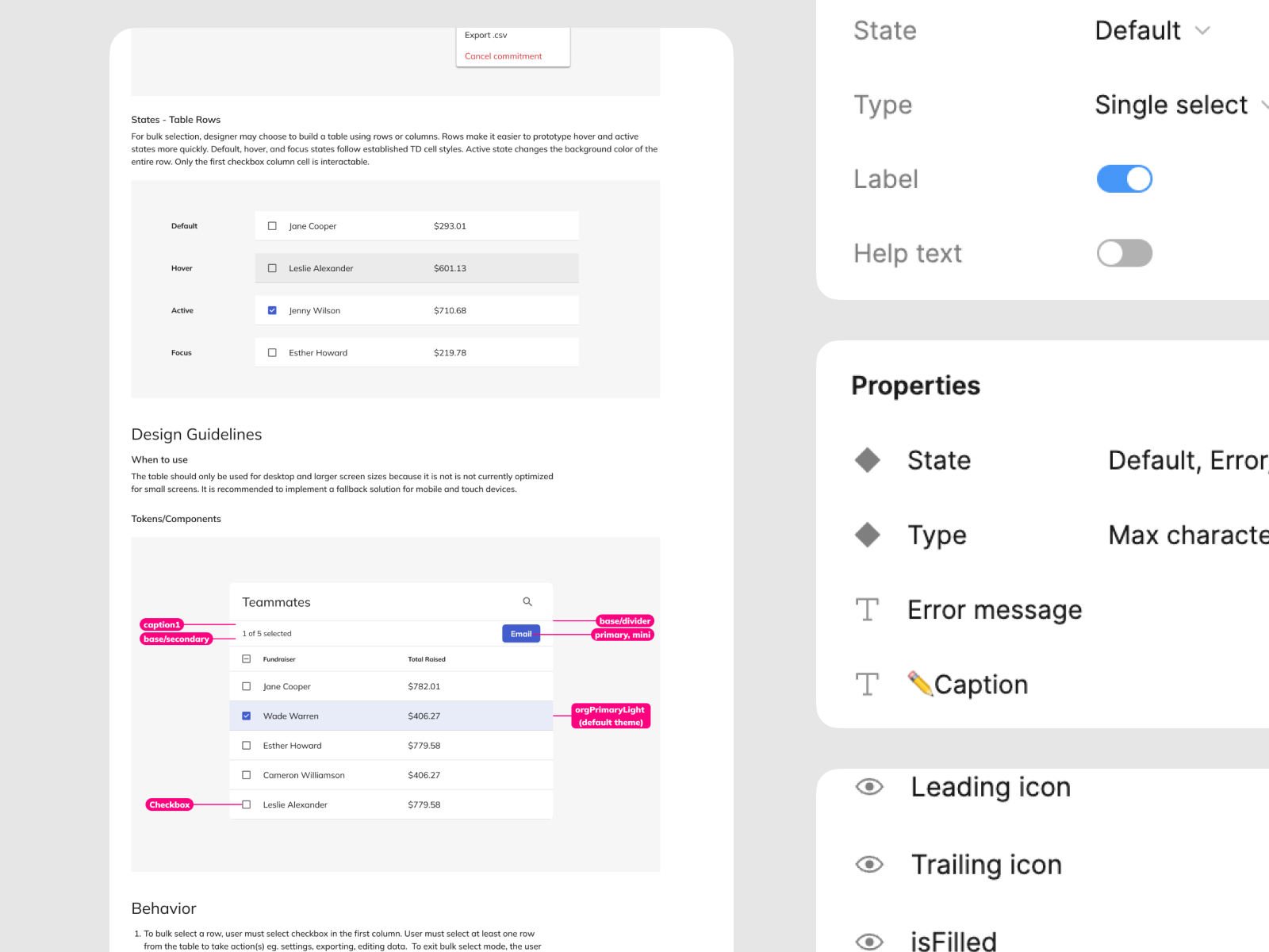
We documented every component and interactive element through detailed specifications on how a keyboard alone would operate with the component.
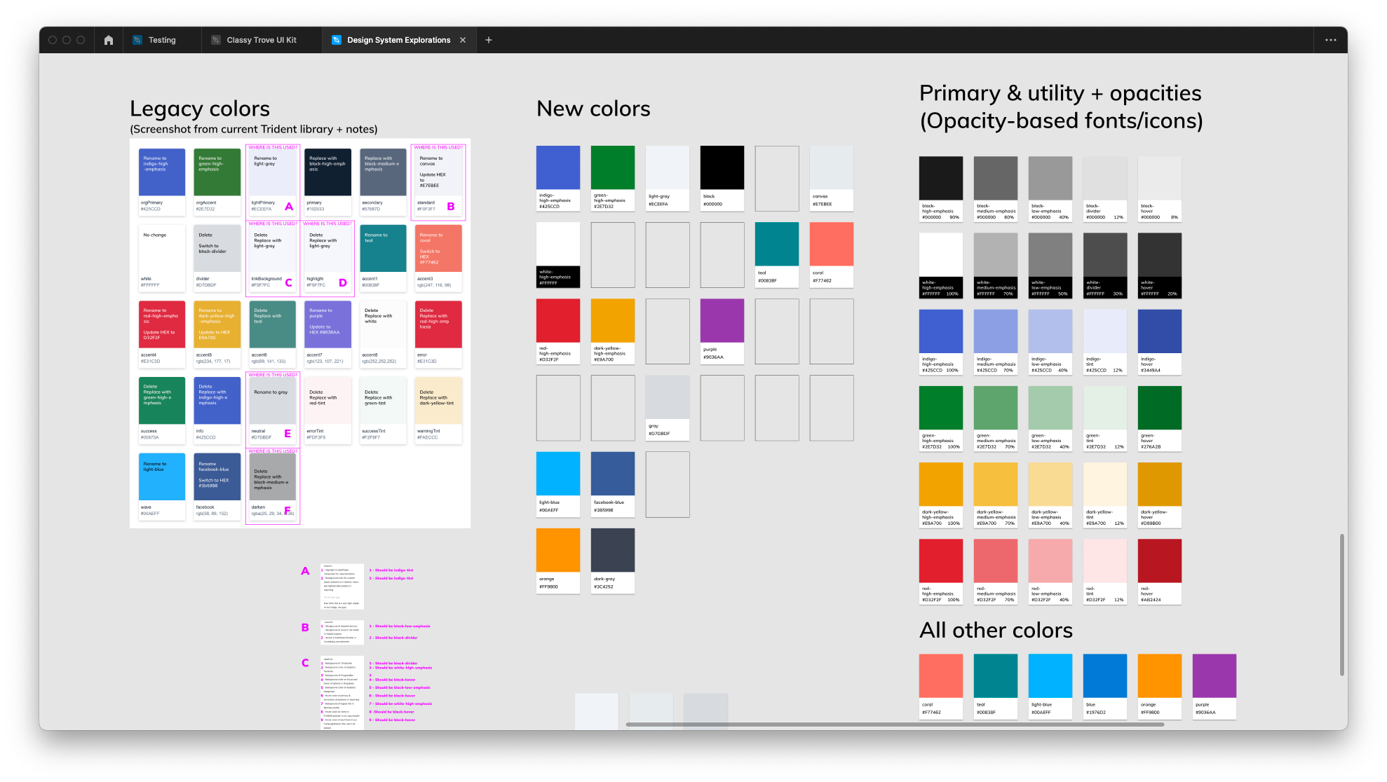
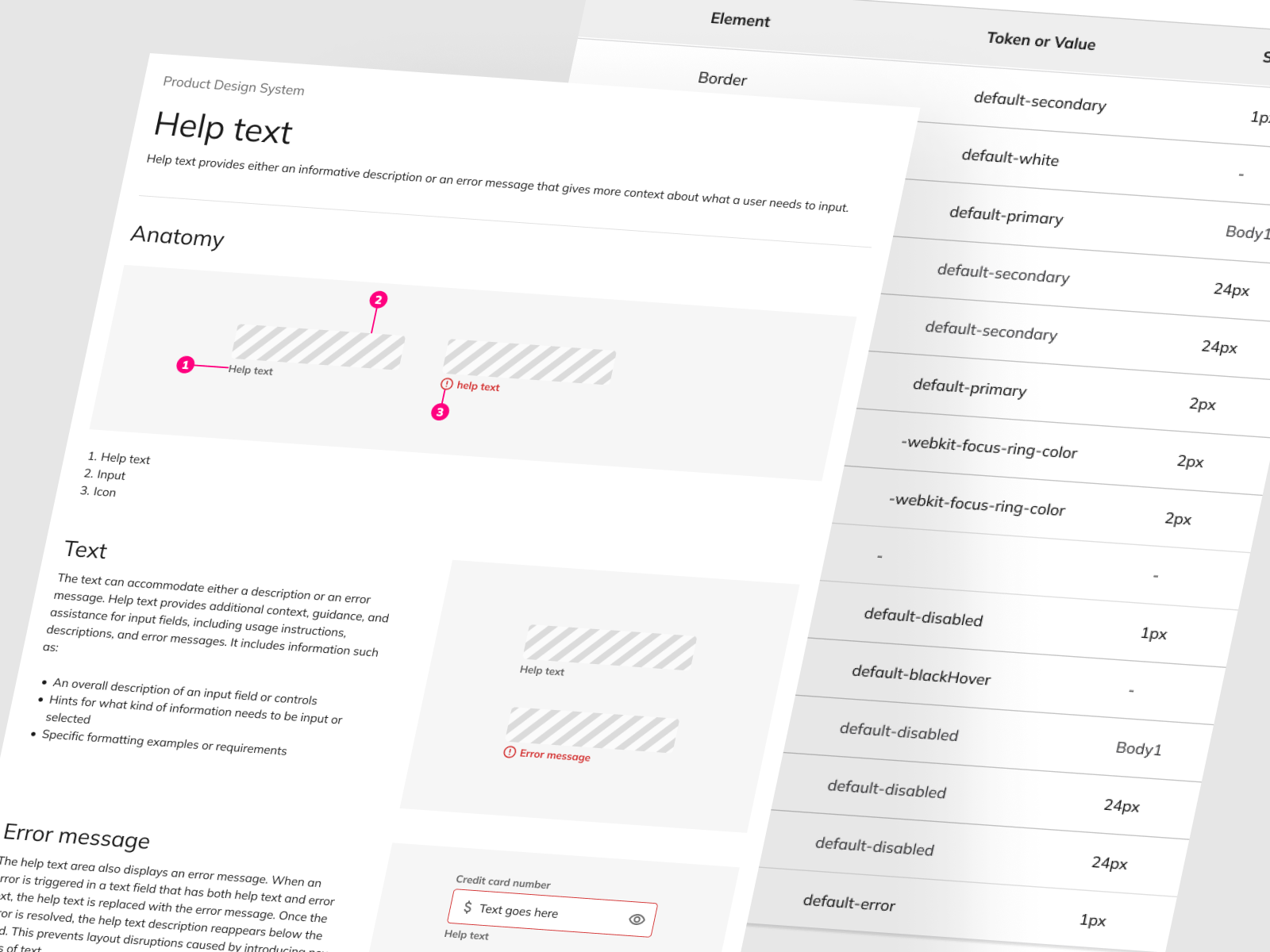
Design tokens
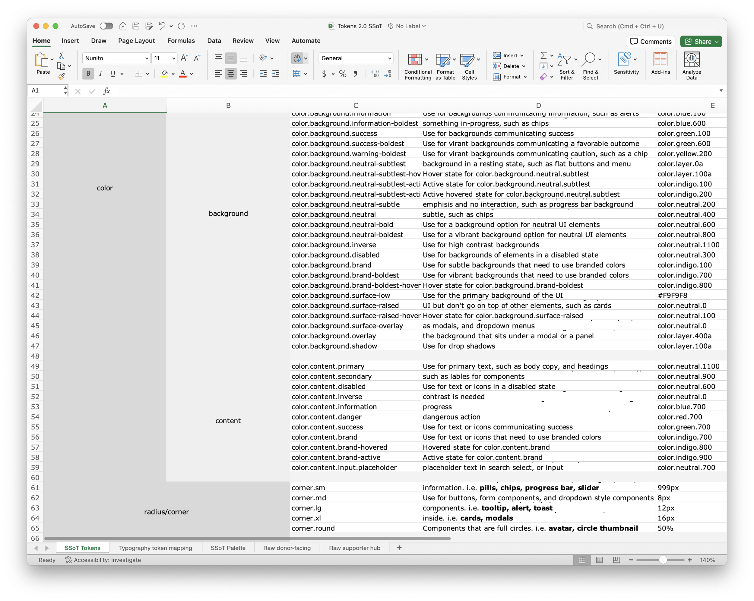
Design tokens represent small, repeatable design decisions. For example, Instead of using exact HEX or px-values, we refer to a token with a name that describes how and where they are used. It makes it much easier to update the design by changing one value in one place and not breaking anything else in-between.
The dynamic nature of design tokens sets them apart from static design components such as a style guide color palette. Unlike the latter, design tokens offer flexibility and efficiency – when a color or any other attribute needs an update, only the relevant token needs to be changed, and the alterations automatically reflect across all instances where the token is used.
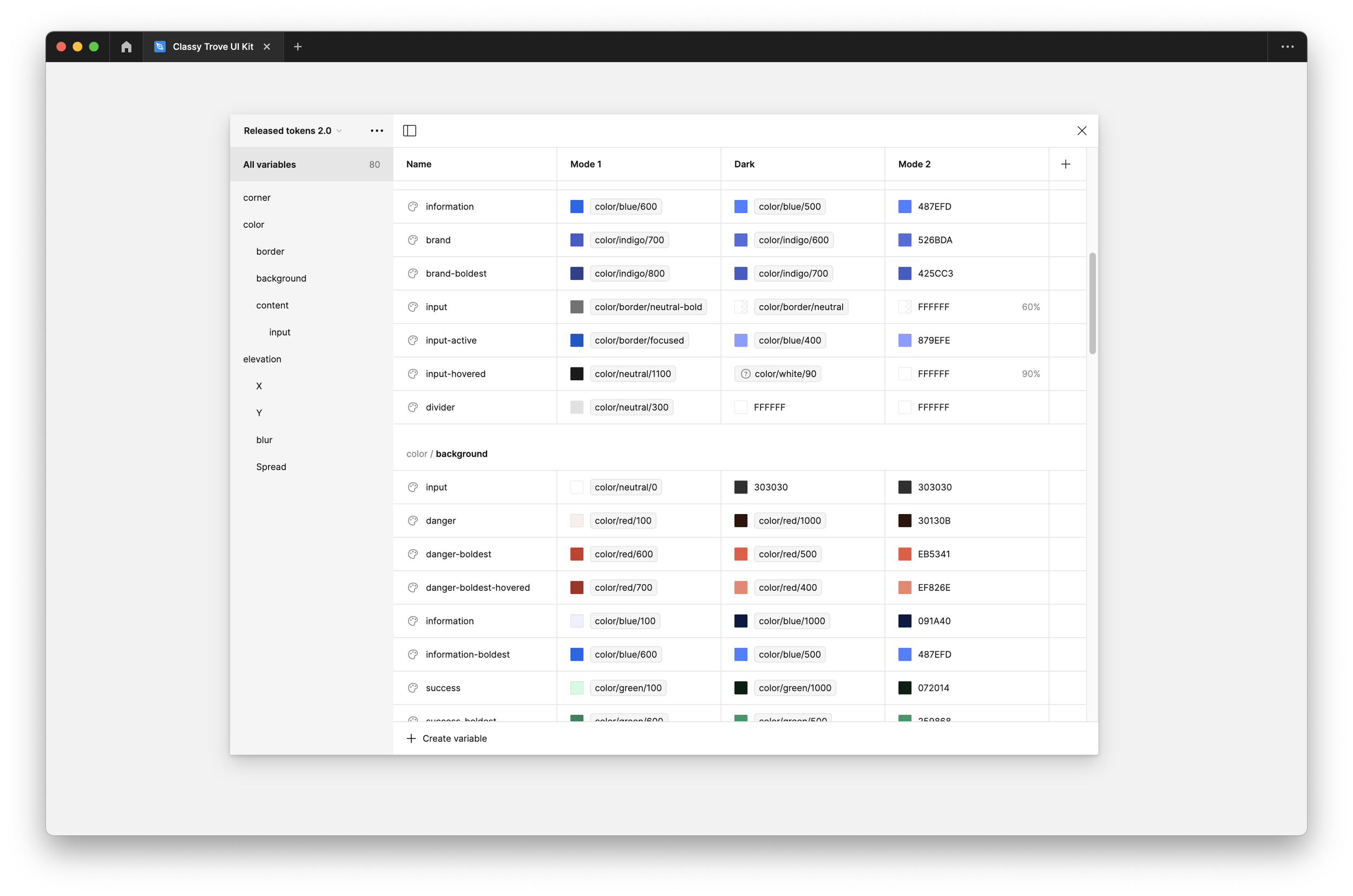
A well-defined naming convention enhances the utility of design tokens. We wanted the names to be descriptive, representing what the token is used for. For instance, a specific color can be denoted as “color.border.danger” instead of a generic “red”. We decided on structuring our naming convention based on token type (color, radius, elevation, typography, etc) to enhance clarity and ease of use. Also to ensure design consistency across all of the teams and platforms we service we needed to create meaningful guides that help. Each design token has certain guidelines and best practices.
Design tokens are building blocks, and managing and communicating them is a large part of what makes a design system run a little smoother.
Design systems are products, not projects
We’re currently in the refine and grow phase, and we’ll never move out of it. As a senior designer who has been involved with numerous design systems, I have realized that the exciting part is that challenges like this will never end. We’re developing a product, it’s not a project that will eventually end, since it will constantly be evolving and growing.
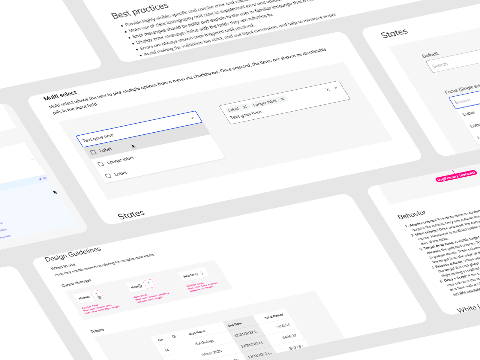
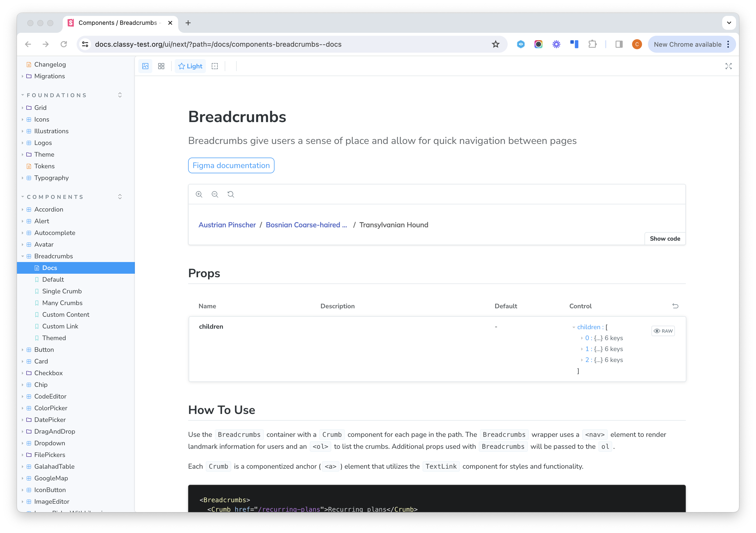
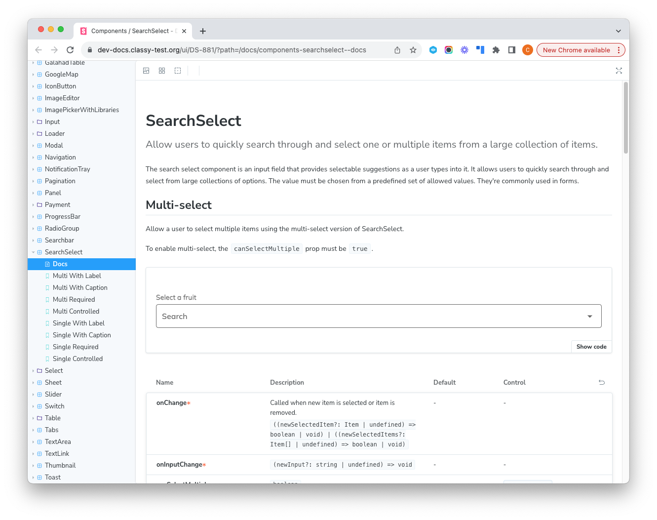
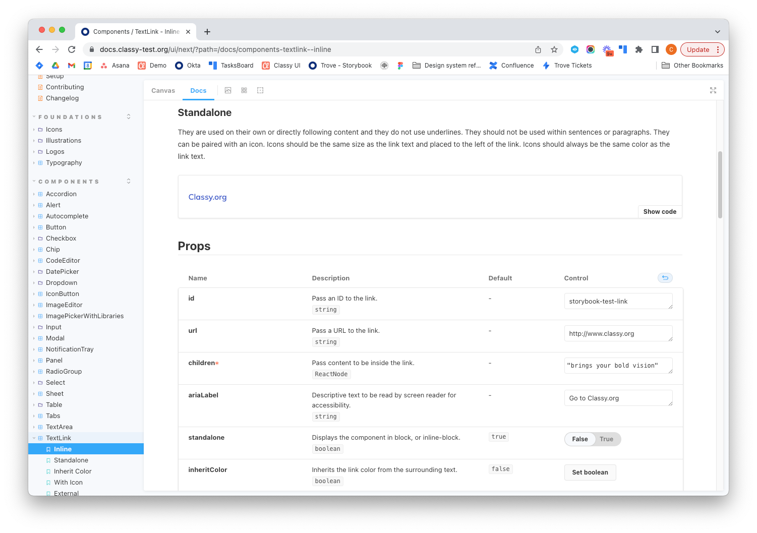
Documentation has been an extremely important part of the design system process. We are creating components that will not just be used by us, but by all designers and developers at the company. It is vital that we create the necessary documentation for people to be able to use the components in the correct way, and to free their mind of worrying about any small decisions. This includes descriptions, examples, accessibility, best practices, etc.
With each new component or pattern that we focus on, there is always a tremendous amount of collaboration. From early exploration meetings with devs, to product critique reviews with the design team, the process of building out quality reusable components is a team effort.
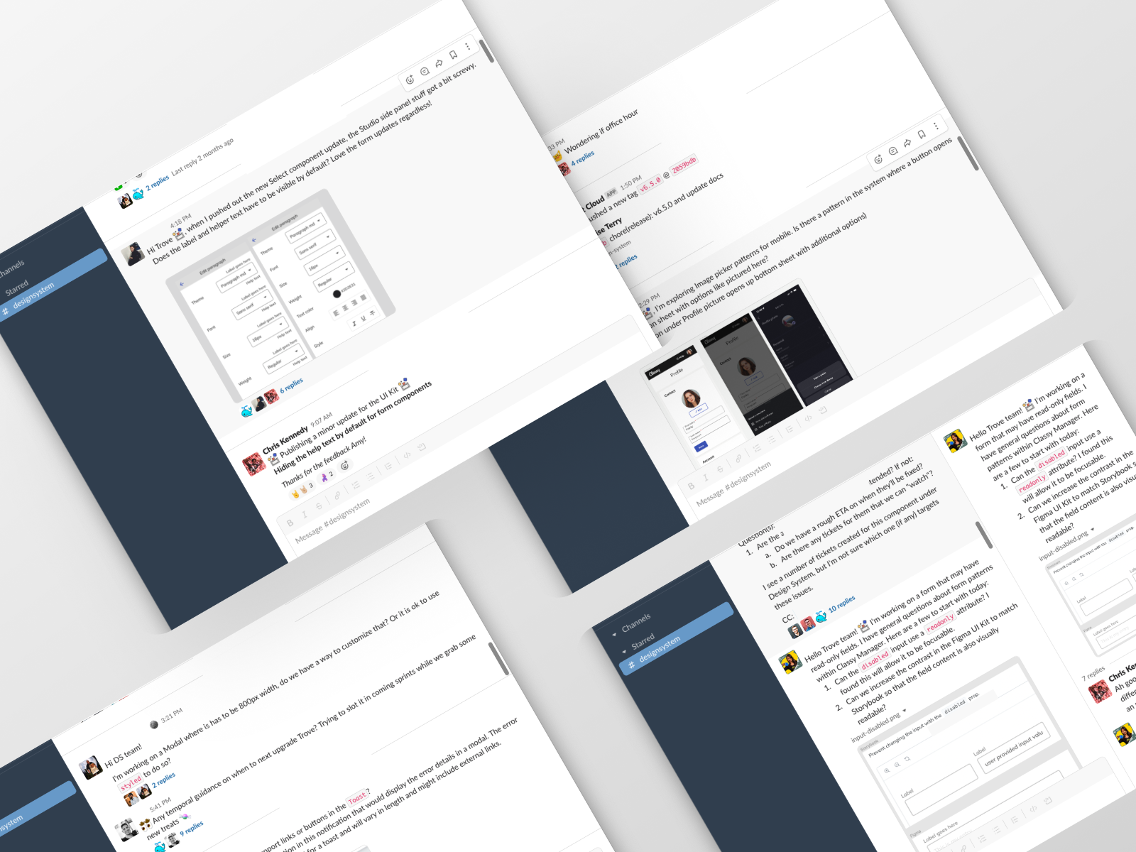
Feedback is your friend
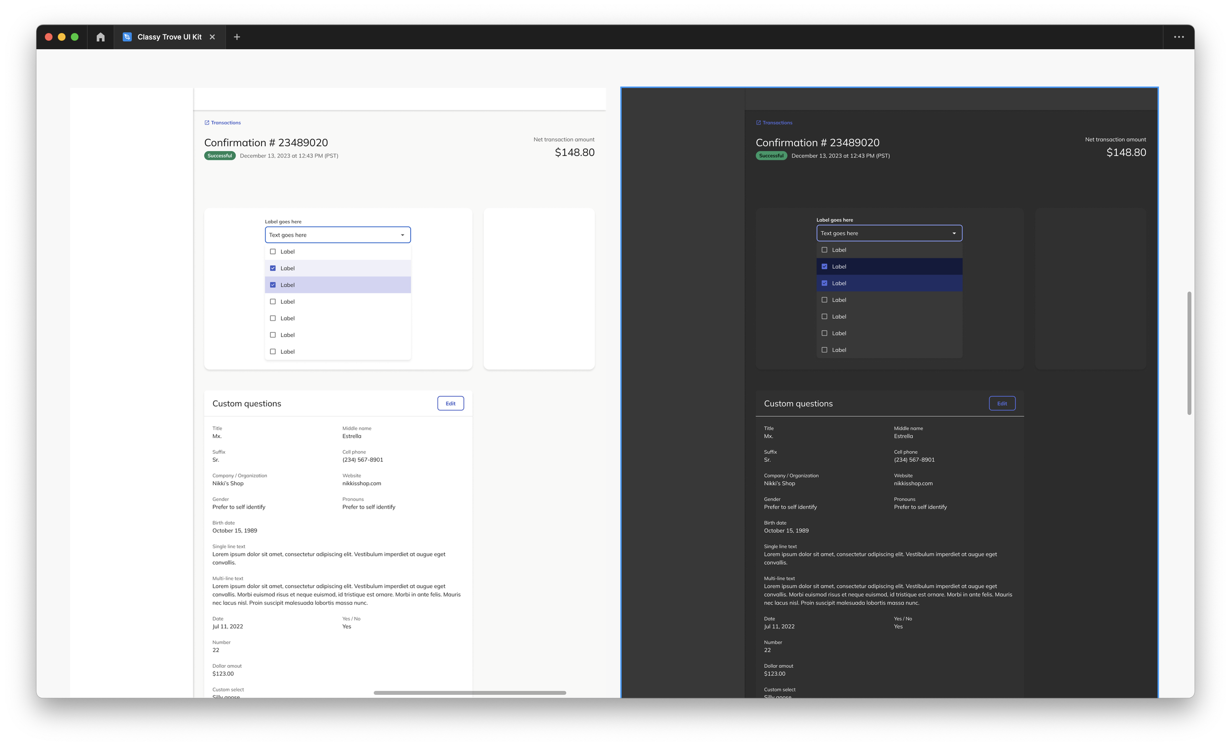
To ensure that the design system is effectively utilized by team members across the company, we established a robust and continuous communication channel with product teams. This includes releasing updates and highlighting them through demos, gathering feedback on the spot and making sure that every designer is aware of the updates. In addition to that, to gain a deeper understanding of the end-user experience, our product teams conduct user interviews to gather feedback and insights on the usability of the components and the clarity of the UI patterns, this feedback is used to iterate and enhance the design system.
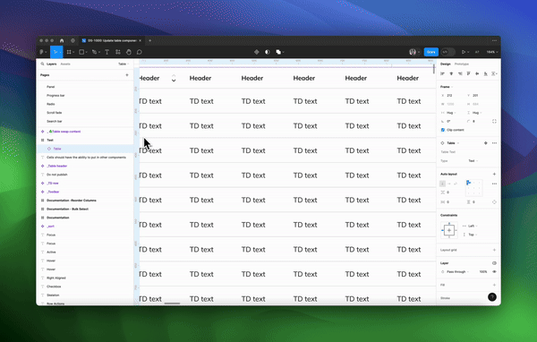
Demonstration for designers on an update to the table component in Figma
Share the love
The fundamental purpose of a design system is to facilitate the work of the teams, which is why encouraging everyone to use it is even more important than building one. Design systems should be integrated into the teams’ workflow, become a key part of a designer’s and developer’s daily productivity, and deliver value to the team members. We also heavily encourage other teams to contribute in designing and building for the design system. The more we can all share our different use cases, the more versatile our component library can become.
Takeaway
The benefits of our system go way beyond UI/UX consistency. We greatly accelerated and scaled our development, improved our product quality, and greatly improved work between developers, designers, and everyone else. Having a design system enables product reviews to focus on the actual concepts and experiences of a design, rather than padding, colors and type choices. This system also enables all of us to prototype and experiment with ideas in high fidelity faster and at a lower cost.
Though having a well-executed design system and comprehensive documentation is important, it's the correct mindset that truly unleashes its potential. When collaboration, adaptability, empathy, and accountability are nurtured, designers and engineers can fully tap into the capabilities of a design system. With the right mindset, a design system transcends being just a tool; it becomes a catalyst for transformation, efficiency, and consistency in the realms of design and engineering, ultimately enhancing the products they contribute to.